Work — Case study

Lieber Solutions.

An earlier agency identity, expressed through form and colour

Project disciplines

Visual Identity Brand Guidelines

Industry

Digital services

Project

Agency identity

Year

2022

Start a project ↗ Discuss a brand project
Project lead
Valentin Sofransky
Visual identity & brand guidelines
Max Maler
Overview Visuals Identity
Start a project ↗

The business context

Lieber Solutions was an earlier identity for our agency. Created in 2022, the work covered visual identity and brand guidelines, built around a butterfly-inspired symbol, a lowercase wordmark and an iridescent colour language.

Valentin Sofransky led the project, with Max Maler responsible for the design. The identity connects the logo system, Urbanist typography and colour treatments across a set of proposed applications.

The original brand presentation carries a 2024 label. Its application visuals show the identity in presentation mockups.

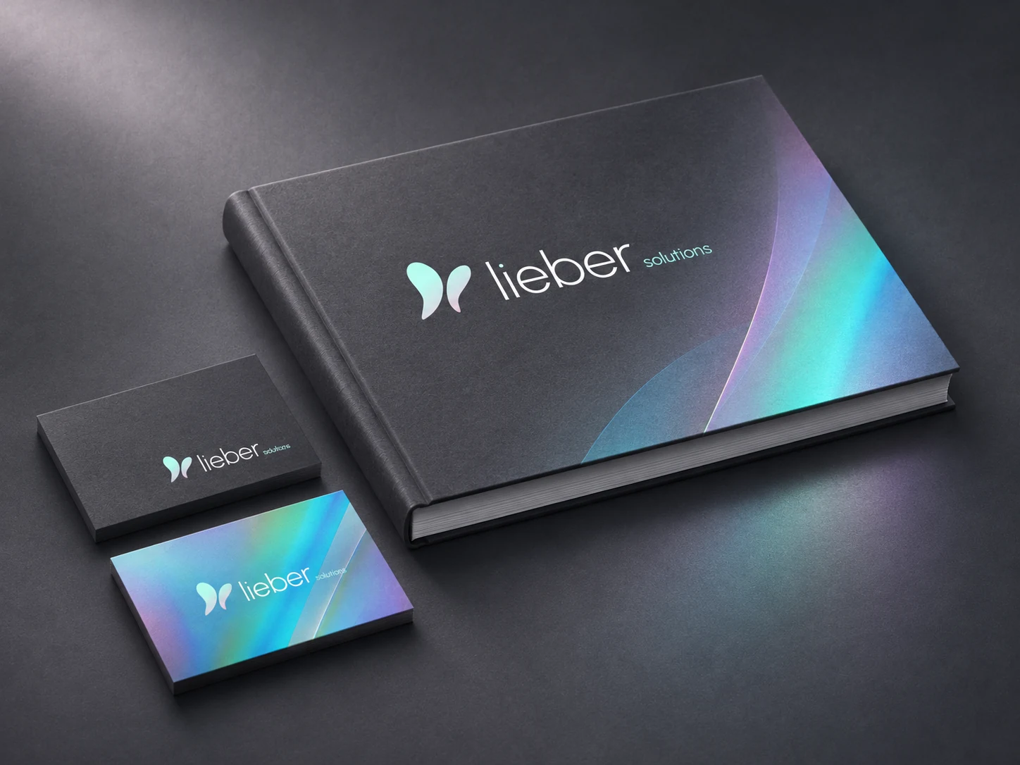
The earlier Lieber Solutions identity presented on a charcoal brand-guidelines book and business-card mockups
A cover composition based on the earlier Lieber Solutions identity.

The visual identity.

Logo system

A recognisable starting point.

Two asymmetric wing shapes form the butterfly-inspired symbol, paired with a thin lowercase wordmark. The brand presentation brings together the main lockup and colour variants, establishing the core elements of the identity.
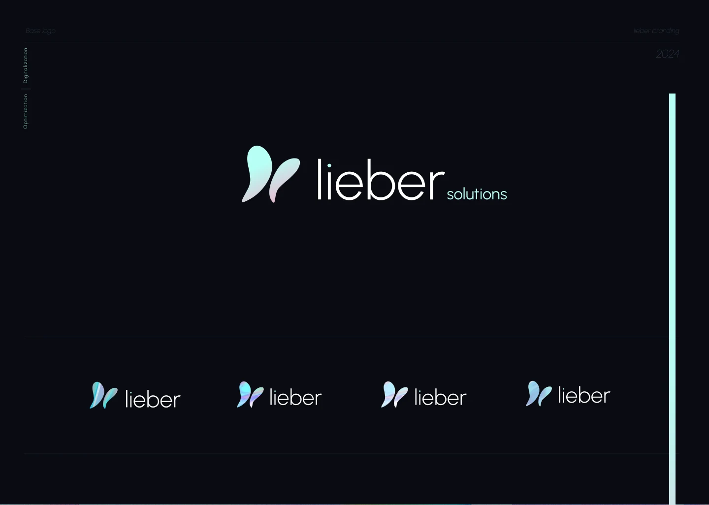
Original Lieber Solutions logo presentation with a butterfly-inspired symbol, lowercase wordmark and colour variants

Colour & typography

Give the system room to move.

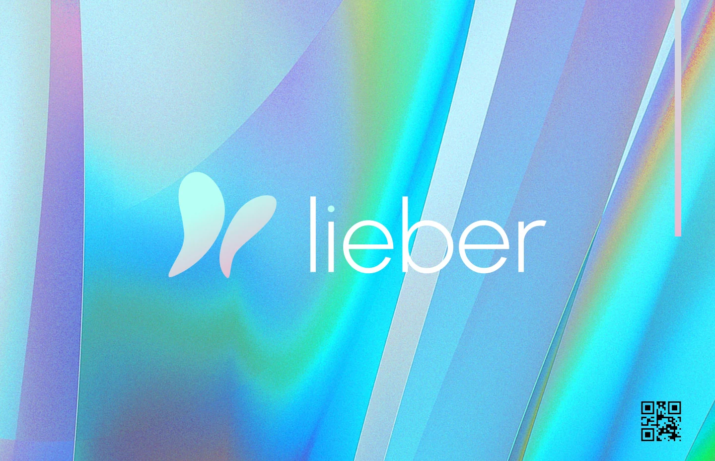
Iridescent cyan, mint and lilac treatments give the symbol and supporting artwork a changing colour character. Urbanist provides the identity’s geometric typography. The brand guidelines bring these elements together for use across applications.

Lieber wordmark and butterfly-inspired symbol over the original iridescent cyan, mint and lilac artwork

Application mockups

Carry the identity into everyday details.

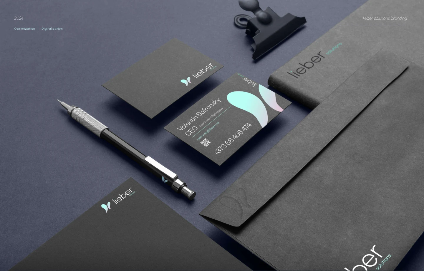
The stationery mockup applies the mark, wordmark and pastel accents to business cards, an envelope and printed materials. Dark paper surfaces give the light typography and colour treatments contrast. These are presentation mockups of the identity.

Original Lieber Solutions stationery mockup with business cards, an envelope and printed materials on a dark surface

A similar challenge in your business?

Connect the next steps.

Explore branding and visual identity
Let’s discuss your goals
← Previous GreenLight Biosciences Biotech · Webflow Up next → Kassen Kompass Insurance · UX/UI & Webflow